-
inspiration: digital preservation jumpers
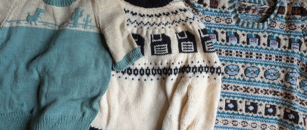
I spent the past six months working as a research librarian (something which I really enjoy, it turns out), and being immersed in the world of research libraries I often came across really cool things that other library people were doing. This post is about one of those things! A few months back I heard… Continue reading
-
on red hats as resistance
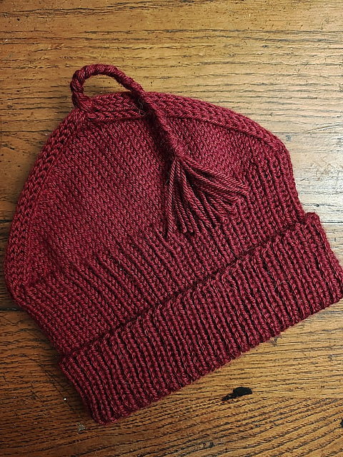
Chances are that many of you reading this will already be familiar with the Melt the ICE Hat pattern by Paul S. Neary. At the time of writing it’s still sitting atop Ravelry’s “Hot Right Now” list, three weeks after publication. There are over 7,300 linked projects (already 700 more than when I checked two… Continue reading
-
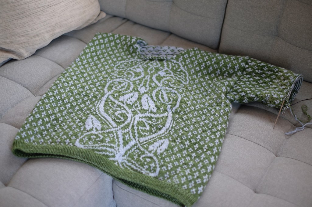
FO: hedgebind
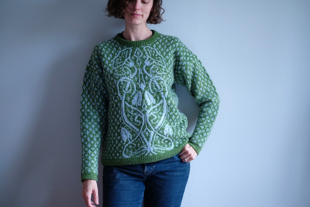
Here comes another finished project from last year, and one I did share as WIP on the blog: my Hedgebind, by Marina Skua! (Ravelry pattern link). I actually finished this sweater back in July, but it took some time for me to get it blocked, and it took even longer to get photos of it.… Continue reading
-
FO: helix, versions 1 and 2
Happy new year! I started a new (temporary) job at the beginning of September, so things have been pretty full-on for the past couple of months. But I’ve been trying to enjoy the changing seasons, first autumn and now winter, and I’ve been getting some knitting done now and then. I thought I’d catch you… Continue reading
-
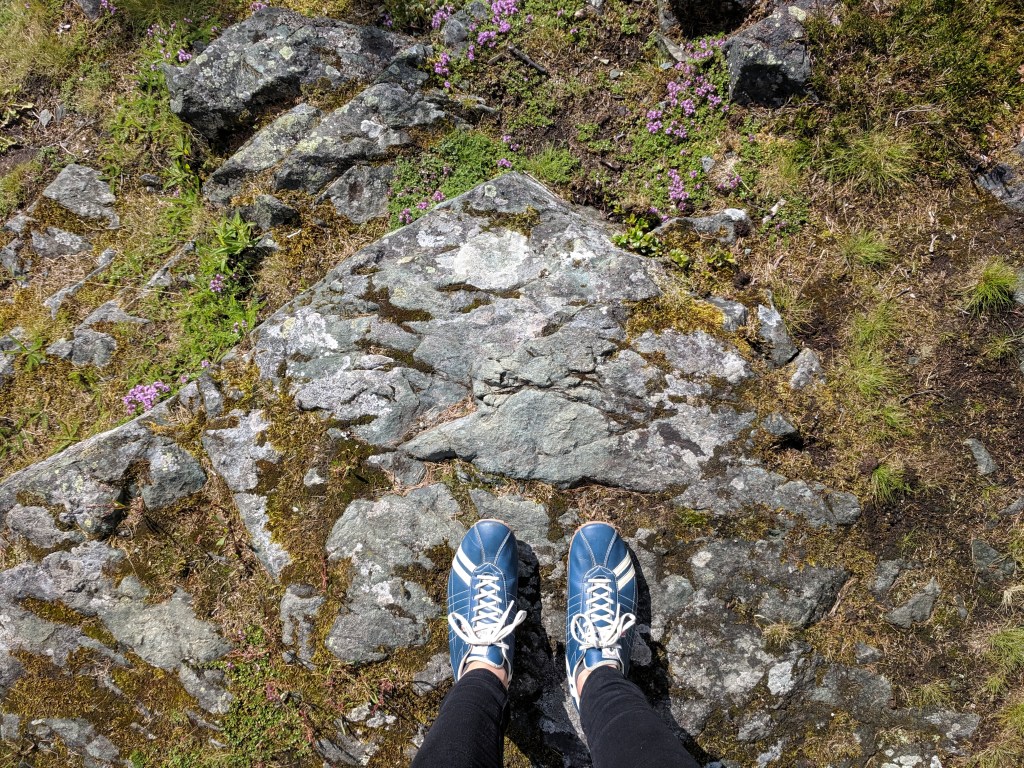
a quick trip to oslo
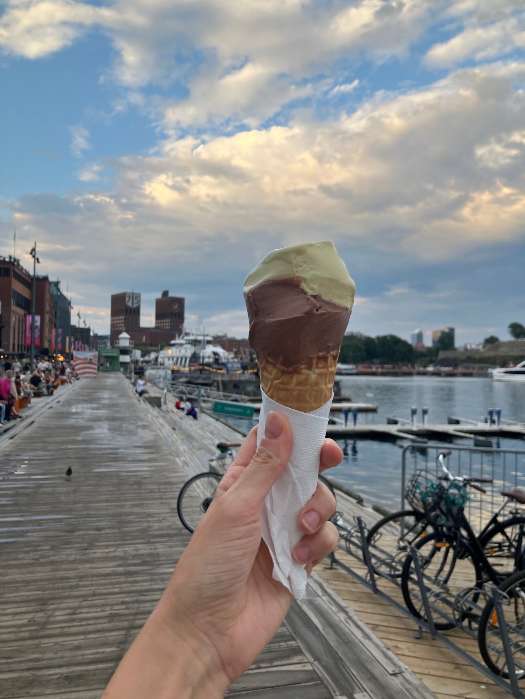
A few weeks back I was fortunate to take a short solo trip to Oslo. In the last five years, I have traveled far less than I used to (between the onset of the covid pandemic and then becoming a parent), and this was my first non-work-related trip by myself since…2021, at least? So it… Continue reading
-
FO: nakti

Of course the first finished object I have to share since my previous WIP check post is one I didn’t even mention in that post. A few days after I published the post, though, I realized that it was coming up on one year since I’d first cast on my Nakti pullover, a pattern by… Continue reading
-
wip check: june 2025
It’s been awhile since I’ve shared progress on my many WIPs, and quite a few of them have yet to feature on this blog. While I’ve been working a little bit on some older WIPs, I’ve also started several new projects in the past couple of months (a decision I am only slightly regretting). So… Continue reading
-
inspiration: hannah ryggen
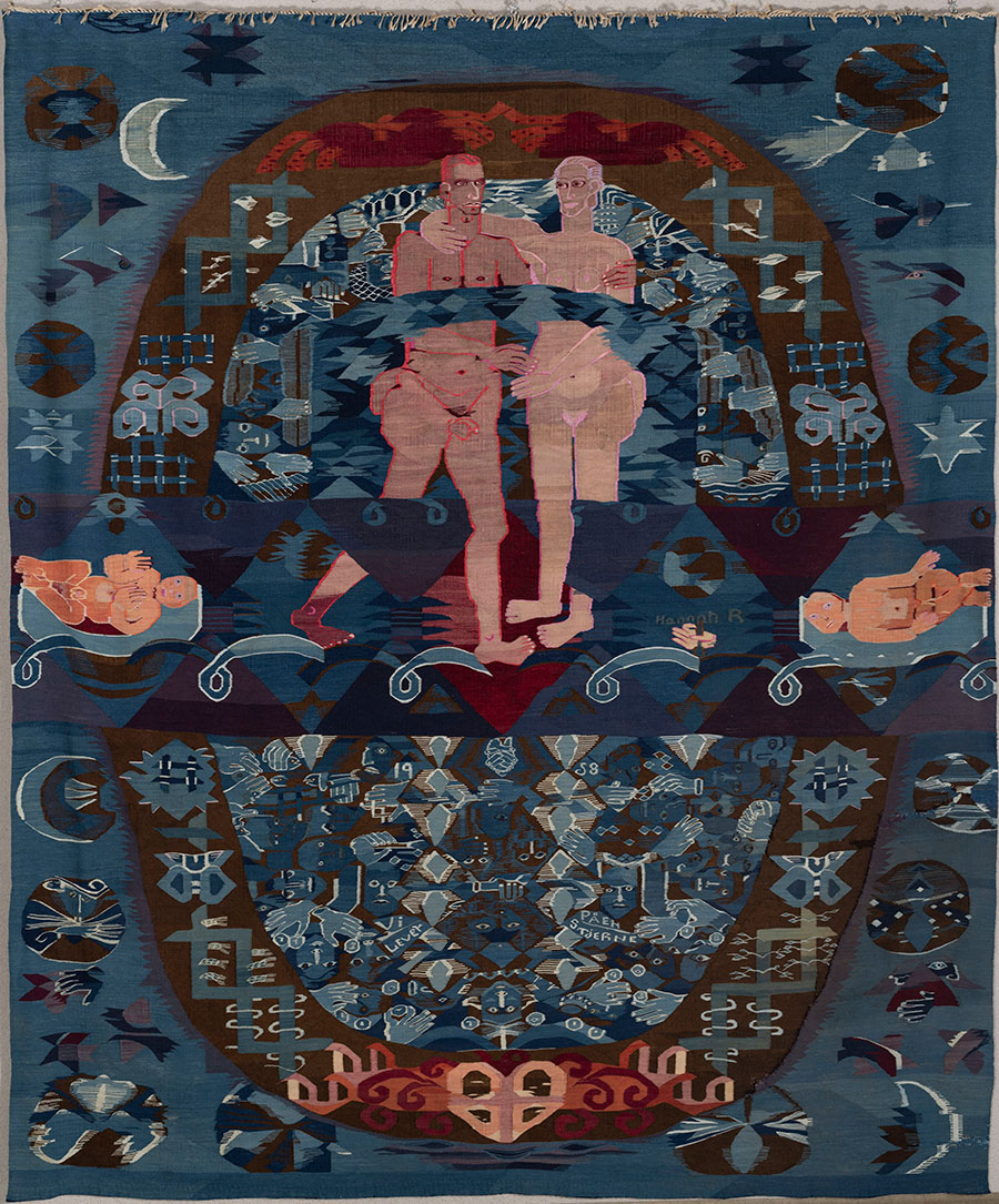
Lately I have been thinking a great deal about the Swedish-born Norwegian textile artist Hannah Ryggen. I previously wrote very briefly about Ryggen’s work on this blog when I visited the Nordenfjeldske Kunstindustrimuseum (the Norwegian Museum of Decorative Arts and Design) back in 2019, but now seemed like a good time to revisit the work… Continue reading
-
books on walking
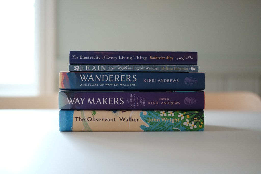
In the past several years I have noticed certain tendencies amongst the nonfiction books I like to read; topics or themes that come up again and again. One of those, perhaps unsurprisingly, happens to be walking (I’ve even created a “walking” tag on my Storygraph account to keep track of it). I thought I’d share… Continue reading
-
wandrian & thoughts on walking
I’m picking up where I left off after an unintended pause in my blogging plans. In my last post I promised to share more about the name of the Wandrian cowl, in the first, and then later this week I’ll have some reading recommendations to share related to the theme. Wandrian is an Old English… Continue reading
-
Subscribe
Subscribed
Already have a WordPress.com account? Log in now.
