amirisu
-
bramble: on yarn choice
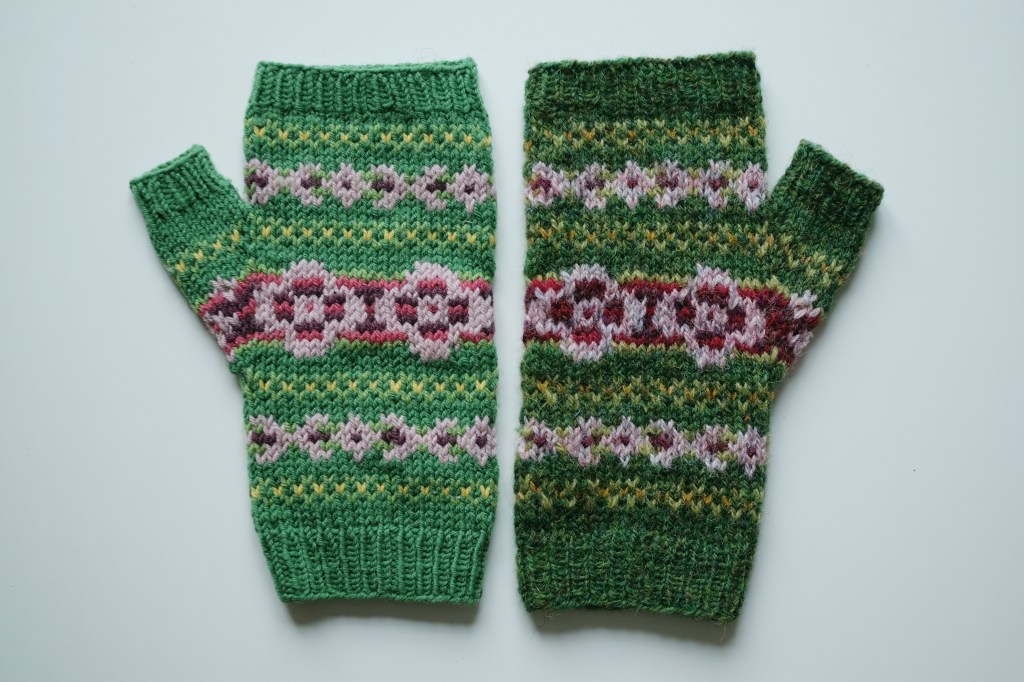
Back in 2020, my Bramble Mitts (Ravelry link) were published in Amirisu. The pattern sample was worked up in Quince & Co. Finch, and if memory serves, this was the magazine’s choice. My original preference for the design was Jamieson’s Shetland Spindrift, due both to the huge range of colors available and the put-up in… Continue reading
-
amirisu wrap-up
The main pattern work I’ve done alongside working on my PhD has been a series of patterns for Amirisu, all but one of which I’ve shared on the blog already (see my previous posts on Bramble and Blomsterkrans, and Kitchen Stories). My fourth and final pattern for Amirisu was published in issue 24, the spring/summer… Continue reading
-
queue check: september 2023
Several years back I would occasionally post a “queue check,” an overview of active project WIPs and plans (fully based on the ones Karen Templer of Fringe Association used to post). Now that I’m carving out a little more time for crafting, I’ve started going back to projects that have been on hold for 2-3… Continue reading
-
kitchen stories (salmer fra kjøkkenet)
I’ve been meaning to share a bit about this design since the autumn 2021 issue of Amirisu came out in November! The issue’s theme is knitwear inspired by films, and I found the process of coming up with a design for this one super interesting, so I thought I’d share both my new design today… Continue reading
-
new work for amirisu
The previews for issue 22 (spring/summer) of Amirisu magazine went live last week, and I actually have some new work to share! For those unfamiliar with the magazine, Amirisu originally started off as a digital-only knitting magazine, publishing bilingually in English and Japanese (they are a Japanese company). Nowadays they’re a print magazine, publishing each… Continue reading
-
a few summer knits
I thought after my last post sharing some summertime snaps, I’d share what I’ve been knitting on for the past month or so as well. There’s actually been very little knitting for the past few days, as much of Norway has seen temps up and over 30°C (or 85°F), which is unusually warm here. My apartment gets… Continue reading
