kitchen stories (salmer fra kjøkkenet)

I’ve been meaning to share a bit about this design since the autumn 2021 issue of Amirisu came out in November! The issue’s theme is knitwear inspired by films, and I found the process of coming up with a design for this one super interesting, so I thought I’d share both my new design today as well as a bit about the film that inspired it. (I did briefly share a few thoughts over on the Amirisu blog back in November, but I’ll go into a bit more depth here.)

Kitchen Stories is a Norwegian/Swedish co-production directed by Bent Hamer (original title Salmer fra kjøkkenet, literally “psalms from the kitchen,” and occasionally you’ll find it with that title in English). The cardigan I designed shares its name with the film, but before I go into too much detail I’m going to take you back to the beginning of the process, when the original brief for the issue came through.

Normally when it’s time for a call for submissions, Amirisu (or any magazine, for that matter) has a theme in mind and they put together a visual mood board to steer you in the direction they want to go. This time, however, the call specified that they were looking for knitwear inspired by our favorite movies, and there was no mood board. I love films, so I loved this brief, but I also found it a unique challenge. With no visual mood board for the issue there were so many directions that designs could go in – likewise with the whole world of movies at my disposal. I feel like my taste in films can be a little eclectic, and the three movies I was able to narrow it down to probably showcase that – they were Kitchen Stories (a quiet and slightly absurd comedy from 2003 set in post-war Norway), Breathless (or À bout de souffle, Godard’s early French New Wave 1960 directorial debut), and My Neighbor Totoro (the 1988 animated Miyazaki/Studio Ghibli film about a friendly forest spirit, to grossly oversimplify).

I put together my own mood board with stills and images from the films to help me start to brainstorm ideas. If I went for My Neighbor Totoro, the visual connection to the film could either be very literal (and thus, cartoony) or slightly more abstract, drawing on the themes of nature and environmentalism – not unlike the other pieces I’ve already designed for Amirisu. If I went for Breathless, which was shot in black and white on location in Paris, stripes seemed to be the overwhelming visual. Classic, but a bit anonymous as well. In the end it’s not a huge surprise I went for Kitchen Stories; the Norwegian setting definitely aligns with my style as a designer, and the film itself has an incredibly strong visual identity.

Isak sits at his kitchen table in the foreground, while Folke sits in his high observation chair in the background
“Salmer fra Kjøkkenet” 2003 © BulBul Film a.s., Regi Bent Hamer, Stillsfotograf Erik Aavatsmark

Kitchen Stories is set in rural Norway in the post-WWII period. Isak, a lone farmer, has signed up to participate in a study being carried out by the Swedish Home Research Institute investigating the kitchen habits of Norwegian bachelors. He regrets this decision and once Swedish researcher Folke shows up, Isak uses his kitchen very reluctantly. Director Bent Hamer was inspired by some of the studies the actual Hemmens forskningsinstitut carried out on housewives during this period, but the addition of Norwegian bachelors gives the film its slightly absurdist twist. At the film’s opening we watch a brigade of Swedish researchers drive their cars and trailers – which the researchers will reside in during the study – across the border to meet the Norwegian participants on the other side.

Swedish researchers driving their cars and blue-green trailers through a snowy landscape on their way to meet the Norwegian participants.

The trailers are all the same shade of minty blue-green, and this color theme continues throughout the film, as Isak’s kitchen walls are also a dusty blue-green color. Given that it’s one of my favorite color families (I’ve even recently painted my craft room a minty blue-green shade), the color palette for the design was clear from the start.

A man and a boy stand outside a building where a mint-green mid-century trailer is parked. The boy is leaning on a mint-green baby carriage in the same shade as the trailer. They both look up to the right.

While the film itself doesn’t necessarily feature stranded knitting, this mid-century period was definitely a heyday for traditional Norwegian kofter, or colorwork cardigans, so I opted to draw from that tradition for the design. It’s definitely a modern take on the garment, though, between the soft pastel color palette (whereas black and white would be more traditional) and the light weight of the yarn and the finished cardigan – in this period kofter tended to be made with thicker yarn knit at a very tight gauge. They were heavy and quite weatherproof, and could essentially be used as outerwear. My Kitchen Stories cardigan is knit with Biches et Bûches Le Petit Lambswool, a woolen spun light fingering weight yarn, knit at a gauge of 26 stitches per 4″ / 10 cm, making it quite appropriate for our well-insulated and well-heated modern interiors.

Masako models the Kitchen Stories cardigan, worn open over a black turtleneck and a brown skirt.
Image courtesy of Amirisu Magazine

The construction is relatively traditional, but with some small differences in technique to suit modern preferences when it comes to working steeks and cutting knitting. The body is worked in the round from the bottom up, with a steek for the front opening, steeks for each armhole, and front neck steek to create the curved neckline. The shoulders are seamed and the steeks are cut open before stitches are picked up around the armhole to work the sleeves top down. The neckband is picked up and knit back and forth, and finally the button bands are picked up from the front edges and worked back and forth. It’s a rewarding if somewhat labor intensive process, and I’m so pleased with the final cardigan. The motif I used came from Anne Bårdsgård’s Selbu Patterns (Selbumønster in the original Norwegian) and it’s one I’ve wanted to use since I first laid eyes on it, with its combination of geometric elements (like the strong diagonals) and organic ones (like the little pine bough motifs bring to mind both foliage but also frost patterns on a window).

The whole issue is a beautiful one (you can see the rest of the patterns on Ravelry here), and one of the things I looked forward to prior to its release was learning which films the other designers used as their source of inspiration. I loved finding out that My Neighbor Totoro made it into the issue after all, with Sari Nordland’s Satsuki (Rav link), a subtle but clever interpretation of the pattern on Totoro’s belly using minimalist cables. I was also happy to see the French New Wave represented as well, with Orlane Sucche’s Cléo (Rav link) inspired by Agnès Varda’s Cléo de 5 à 7. I’m so grateful that I got to be part of this issue.

new work for amirisu

The previews for issue 22 (spring/summer) of Amirisu magazine went live last week, and I actually have some new work to share! For those unfamiliar with the magazine, Amirisu originally started off as a digital-only knitting magazine, publishing bilingually in English and Japanese (they are a Japanese company). Nowadays they’re a print magazine, publishing each issue in an English/international version and a Japanese version. They also have a brick-and-mortar yarn store in Japan called WALNUT that I’d love to visit someday.

I’ve been a fan for a long time so it’s been a real pleasure to get to work with them on some designs for the magazine. I have one pattern in issue 22, and I also have a pattern from issue 21, the fall/winter issue, that I haven’t shared here so I thought I’d share that as well. But first, my pattern for the new issue!

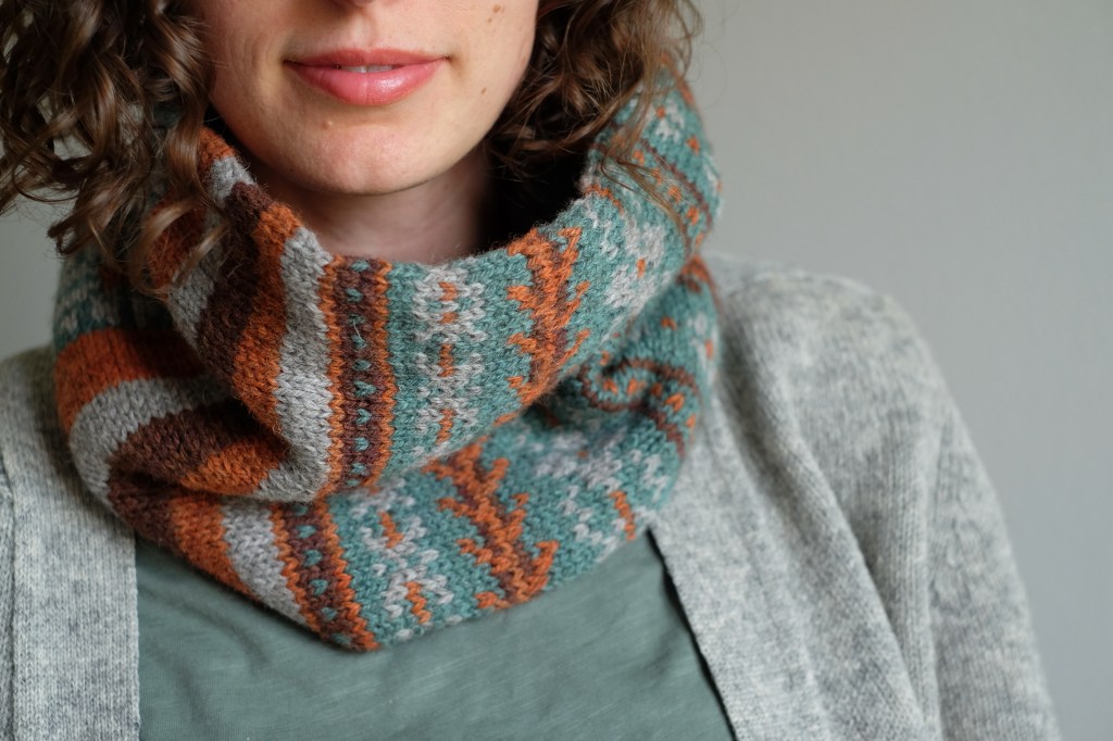
This hat and cowl set is called Blomsterkrans (Ravelry link), a Scandinavian word meaning flower wreath/crown or garland. I’m very pleased with how both pieces turned out. We used Knitting for Olive Merino, which is a light fingering non-superwash merino wool, and the finished fabric is lovely. The center of the flowers is worked in duplicate stitch to add a pop of color, so there are no three-color rounds in these pieces.

Amirisu’s photography is beautiful, as always. Colorwork can always feel a little funny in a spring/summer issue, but these are lightweight pieces that are certainly suitable for the Scandinavian summer, if not the typical Japanese one.

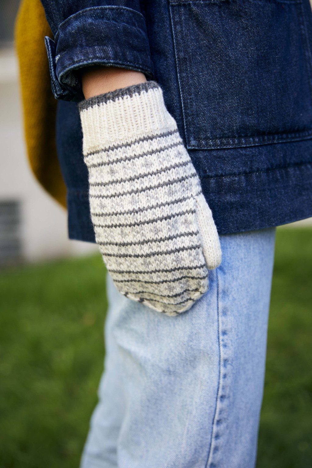
The other pattern I wanted to share was my piece for issue 21: a pair of colorwork mitts called Bramble (Ravelry link).

These were quite fun to design, because they lean more towards Fair Isle knitting than Scandinavian. I also love how they styled the model for the magazine, and I never would have thought to pair these mitts with a coat in that color. These use six colors in total, so the color choice adds a lot of room for creativity and the finished mitts can look incredibly different depending on which colors you choose. It’s also possible to simplify and use only five of fewer colors. I’ve really enjoyed seeing finished projects of this one.

It’s also nice to revisit them, because seeing them in the photo reminds me that I was working on this sample on my last international trip pre-Covid, when I was in Rome in February of 2020. It takes me straight back to the memory of sitting on the hotel bed, knitting on these with the window open, hearing the sounds of the city outside and enjoying the soft sunlight filtering through the curtains. I’d forgotten how travel knitting can be transportive that way; it makes me excited to travel again. Eventually.

Blomsterkrans shoot
Photos: Masahiro Shimazaki
Hair/makeup: Yoko Yoshikawa
Model: Kana

Bramble shoot
Photos: Masahiro Shimazaki
Hair/makeup: Yoko Yoshikawa
Model: Masako

winter solstice collab with the crimson stitchery

One of the projects I was working on over the fall was a small collection done in collaboration with Anushka of The Crimson Stitchery. I’ve mentioned Anushka and her YouTube channel on this blog a few times before, including when I shared a few favorite video podcasts earlier in 2020. So deciding to do a design collaboration together was a great deal of fun and an interesting creative challenge as well!

We took the winter solstice as our starting point, and created a shared mood board with imagery representing our own ideas about the winter solstice. Already it was interesting to see the differences – I associate it with moody blue light, short daylight, snow, and frost, while Anushka’s associations were more in the direction of the sparkling festivities of the season. We decided we would both create accessories rooted in our shared inspiration – using different techniques (colorwork for me, cables for Anushka), but both incorporating color and texture play and using the same yarns. I think both our designs evolved along the way, as we sketched and swatched, but I really love where we ended up.

We each designed a hat pattern and a pair of fingerless mitts, and I thought I’d share each of them here in brief. If you’d like to hear about them in a little more detail, I made a video about my designs (which can be found here), as did Anushka (and her video is here).

Dianna wears a burgundy and gold hat with a pattern of colorwork diamonds while standing in front of an old brick wall and set of doors with fancy ironwork.

My hat is the Lebkuchen hat (on Ravelry here). Worked up in fingering weight, I used a metallic chainette yarn for the contrasting color for a pretty fun and glitzy effect. While the gold yarn was incorporated into all four of our pieces, this is the only one where it’s not simply used for a trim. I’ve been wanting to play with metallic colorwork for a long time, and I plan to keep exploring the creative possibilities it opens up!

A pair of colorwork fingerless mitts in shades of burgundy, off-white, and blue laid out on brown paper with evergreen branches arranged around them.

My mitts, meanwhile, are the Pepperkaker mitts (Ravelry link). These are worsted weight and work up quite quickly, which is always very satisfying! If you watch the video I made about my designs, you’ll also see the full mitten version I was working on. I’ll admit I stalled on those once I got to the thumb of the full mitten, but I do still intend to release that version as an option with the pattern!

A knitted hat featuring a diamond cable pattern in tealy blue with off-white trim and a burgundy pom pom lays on a grey floor surrounded by leafy branches and pine cones.

Anushka’s hat is the delightfully squishy Brandy Butter (Ravelry // Payhip). Another quick knit in worsted weight, it’s a mix of cables, stockinette, and ribbing. The diamond cable centered on the front echoes the diamond motif of the colorwork in my Lebkuchen hat – having the designs nod at each other that way was a deliberate choice, and it was fun to work out how we were going to do that as we worked on the collection.

And lastly, Anushka’s Ginger Snaps mitts (Ravelry // Payhip). I love these cabled mitts and I think I’d like to knit a pair for myself, probably with some modifications. These are worked in fingering weight, and I love the classic look of the cables she chose for the back of the hand.

We’re so pleased with the collection overall and I do love how the pieces work together as a set. Collaboration often pushes me to make slightly different creative decisions than I’d make working totally on my own, and that’s really refreshing sometimes.

new pattern: rue du tage

353b895fc877f137-2019-11-240411471

Last week I released another new pattern: Rue du Tage. I’ve been working on this one for quite awhile, and teased it on Instagram over the summer. I finished the scarf in November and have been weraing it nearly nonstop ever since; it is my favorite kind of properly-bundled-up scarf, worked in the round so it’s doubly thick, and long enough to wrap around your neck with both ends tucked into your jacket. This kind of scarf can cover the bottom half of your face if you wear it right, and it holds up against the cold wind.

7483d9fc82ddfe9a-2019-11-240411591

I had an immense amount of fun both designing and knitting this scarf. It’s worked up in La Bien Aimée Mondim, a yarny collaboration between La Bien Aimée in Paris and Retrosaria Roma Pomar in Lisbon. Mondim is made for Rosa Pomar from Portuguese wool, and this hand-dyed incarnation is then dyed by La Bien Aimée in Paris. I used three colors for this design, but you could easily use more if you wished, which would make this a great leftovers project.

The Mondim is a sturdier wool than your typical hand-dyed merino – admittedly less soft, which will mean some knitters might not want to use it for a scarf, but for me it’s soft enough to wear it next to my skin (especially if it’s cold out). I found the yarn worked very nicely for colorwork, and I definitely had trouble putting the project down once I got going on a motif. Of course you could substitute other fingering weight yarns as well, especially if you have more than a few kicking around your stash (like I do).

dce79e80579ca04f-2019-11-240411561

The fact that the yarn is a collaboration between La Bien Aimée and Rosa Pomar is what led to the name for this design. I was a bit stuck on the name for awhile, but while browsing a street map of LBA’s neighborhood in Paris I spotted a street called Rue du Tage. A quick search confirmed my suspicions: this street is named for the Tagus river which runs through Spain and Portugal, with the river’s mouth in Lisbon. It’s a funny coincidence, to have a street around the corner from La Bien Aimée named for the river that Retrosaria Rosa Pomar sits within walking distance of. And so Rue du Tage it was.

Thanks to La Bien Aimée for generously providing yarn support for this design. And I hope you all like it as much as I do! You can find the details about yardage, needles, and all the rest on the Ravelry pattern page.

new pattern: oak hollow

Processed with VSCO with 6 preset

I think it’s been a long time since I’ve written a dedicated blog post for a new pattern, but now that I’m publishing new designs less often (I think 2019 will be an 8-pattern year compared to last year’s 24), it feels easier to sit down to write about a new design. I’m very pleased to introduce you to a pattern that’s been a long time in the making: meet Oak Hollow.

Some of you may be familiar with the fact that I’m quite interested in non-superwash hand-dyed yarn. Of course there’s a lot of superwash hand-dyed yarn in my stash as well, but as dyers have increasingly been experimenting with non-superwash bases, I’ve been increasingly excited about it. So in June 2018, when Canadian dyer Lichen and Lace announced a new base made with non-superwash Canadian wool, I knew I wanted to try some (Lichen and Lace is located in New Brunswick and I was living in Montreal at the time, so while they weren’t exactly “local,” they were only one province to the east). So I ordered myself three skeins of Rustic Heather Sport.

c1d8f1a79374034f-oakhollowYARN

Being very fond of grey, I ended up with only one skein that was actually dyed – that gorgeous yellow to the left, Pollen. The two greys (Charcoal and Birch) are undyed colors. Yellow has never featured hugely in my wardrobe or my design work, but I thought this combination was absolutely gorgeous, and last summer I was already charting up an idea for a pair of fingerless mitts. I was incredibly busy with other patterns last fall, though, and didn’t get around to starting these in time for them to be a fall release. And there was no question to me that they should be a fall release. So they got put on the back burner for awhile.

When it came time to pack our suitcases for the move to Trondheim last May/June, I knew I’d have to be selective about what projects and yarn to pack (the majority of our stuff came separately and we will finally be reunited with it later this month when we move into our new place, and I am SO glad!). Not knowing how long I’d be away from the majority of my stash, I made sure to pack these skeins in the suitcases so that this pattern could happen this year.

9bd60116d0fc26fa-2019-10-200549141

In the end, it still took some time, and some trial and error. Some patterns just do. The first mitt I started working up I probably got three quarters of the way through before I realized/accepted that it was actually just way too small. I set it aside, went up a needle size, and started again. This time I knit the pair, which fit much better with one exception – after finishing, blocking, and wearing the mitts for a week or two, I realized I wasn’t happy with the thumb gusset, which was still too small. So I frogged the finished mitts back to the place where the new thumb gusset would begin – which felt very close to the beginning – and knit them back up. But the effort was worth it! The new thumb gusset was a much better fit, and I’m so happy I took the time to get this one right, rather than rushing through it, even though that meant the pattern didn’t come out until November 1. Maybe it still feels like autumn where you are, or maybe you’re still waiting for the autumn weather to show up, but in Norway? Winter is setting in. We’ve had our first snow of the season today in Trondheim, and I know the Oslo area had the same this weekend. It’s beautiful, but it’s been nice to hang on to autumn a little bit through this design.

Processed with VSCO with 6 preset

I’ve been blown away by the enthusiastic response to this design and I can only say thank you. It’s been so much fun to watch projects popping up on Ravelry and Instagram already. If you’d like to make your own mitts, Oak Hollow is knit with three colors of sport weight yarn at a gauge of 28 stitches per 4″/10 cm (at that gauge a fingering weight would probably also work for these mitts, particularly if it’s woolen spun), and the pattern is written for two sizes. I think it would be relatively easy to work in two colors instead if you didn’t want to bother with the very small amount needed of the third color. Overall, these mitts don’t use a lot of yarn and would be great for leftovers. You can find all the details on the Ravelry pattern page.

78584e6a43a7901d-2019-10-200549202

peak fall

3159e4cf9297329b-2019-10-200549221

I think Trondheim finally hit peak fall color in the past week (yes, I know, I am still talking about autumn, but I just can’t get over how long and slow it is here!). But on Tuesday a serious windstorm blew through and knocked down quite a few of the leaves. I have a few snaps from the weekend and the past few days, though, that show some of the beautiful golden color I’ve been surrounded by lately. Luckily, there are still a few leaves still hanging on even after the windstorm, though these photos are all from beforehand.

98143455187288a5-2019-10-220434292

bb9588ce358f1c90-2019-10-220434301

e163ddcb16eef9a6-2019-10-060448291

I’ve also finished a few knitting projects lately. Both the No Frills I mentioned in my last post, as well as the Featherweight Cardigan you can see in this one, and I also finished up a new design. We got to take some pattern photos last weekend, pre-windstorm, and it was nice to take advantage of the fall colors both on the trees and blanketing the ground. These mitts are for a pattern that will be called Oak Hollow, about which more soon.

c49ca8e511e023ce-2019-10-200549172

If it’s fall in your part of the world, I hope you’re getting the chance to soak up some color. The autumn gold that’s ubiquitous in Norway always makes me feel like I’m in Lothlorien (especially if it’s a birch grove), and I love it so much.

c1070ec0a9954aac-2019-10-200932461

looking back at 2018

ed94abe49869f113-2018-12-221032351

I’ve been taking some time to look back, as one is wont to do at this time of year. Yesterday was the winter solstice, which means this year has almost drawn to a close. 2018 has been quite a year. I released a lot of patterns this year. I knew I had done more work than usual, and kicking it up a notch in the first full calendar year after finishing my master’s degree was the plan, but still, when I sat down to count out how many new designs I actually released, I was stunned to realize there were twenty-four of them. 24 new patterns in 2018! Fifteen of those came in the form of three collections. I am absolutely astonished at my own productivity. Of course, there are some things that helped make this achievable – working with third parties always makes the work less for me, and tied to that is the fact that the work for some of this year’s releases was actually done in 2017 (or in the case of Fog & Frost, even earlier). Sample knitters also knit a few of these samples. These are all things I’m grateful for as someone designing and writing knitting patterns. But here’s a look at my 24 patterns of 2018 (a list with links will follow in case something piques your interest):

306ef9040391ffe6-2018review

From left to right –
Row 1: Frost FlowersLyngenAlice Mittens
Row 2: Mountain HumPolar NightNorth Wind
Row 3: West WindCloud PineAdrian
Row 4: OpalDortheaTurlough
Row 5: DrumlinWeekend Walking MittsCaithness
Row 6: Tremblant ToqueLe Massif ScarfSutton Slippers
Row 7: Stoneham PonchoBromont MittsBrave at Heart
Row 8: Just and LoyalWit Beyond MeasureGreat Ambition

The collections are definitely all highlights – Fog & Frost, the Chalet Collection for Espace Tricot, and Lion, Badger, Eagle, Snake. The reception for the latter two in particular has been incredible, and I don’t know how to say thank you in a way that actually conveys my gratitude. But thank you.

A few of these patterns were published in books, and it is always exciting to see my name and my work in print. Opal and Dorthea were published in the Norwegian book Ruter og Lus: Retrostrikk fra Salhus Trikotagefabrikk (which I wrote about here) and I still can’t quite believe the museum wanted me of all people to be involved with that project. And then Caithness was published in Kate Davies’s new compilation of hat patterns, Milarrochy Heids, and it means a great deal to me to be included in those pages and to call Kate a colleague and a friend.

I also returned to teaching this year, giving a few classes at Espace Tricot and teaching a full weekend of workshops at Twist Festival in Saint-André-Avellin, Québec. I spent eight months of this year working at Espace Tricot as well, getting to know local knitters and making friends and generally becoming a part of the wonderful fiber community in and around Montréal and Québec, so being invited to teach at Twist was a highlight. All the classes I gave were colorwork related, and it brings me so much joy to share my love and knowledge of colorwork with other knitters.

bf0e595753941bc1-twist-teaching

9d9436da58ccd623-twist-interview

abb7d2ee9077b0c3-twist-knitting-it-up

From top to bottom: teaching my Traditional Mittens workshop, being interviewed by Transistor Media (you can listen here), and hanging out with buds in the Knitting It Up Yarns booth (first two photos by Sébastien Lavallée for Twist Festival, third photo courtesy of Annie of Knitting It Up)

While I’ve been invited to teach at a few retreats and events in 2019, I’m not anticipating very much teaching in the coming year, I’m sorry to say. The reason for that is that I’m likely looking at another big move next summer (which can make event planning difficult-to-impossible), but more on that at a later date.

Plenty of other things have happened this year – I read 30 books, I learned a new craft, I traveled to some new and exciting places as well as some old and familiar ones. I feel I have so much to be grateful for right now. Given the year I’ve had, I’m taking it easy for the last few weeks of the year, and I’m looking forward to spending the Christmas holiday with family and friends. I am especially grateful to you, my readers, followers, customers. You all are a massive part of the wonderful year 2018 has been on a professional level, and I can’t say thank you enough. My birthday falls on the first of the new year, and some of you may remember I held a birthday sale on patterns last year – keep an eye out, because I plan to do the same this coming year. It’s such a nice way to say thank you for the year just gone by.

Whatever the end of 2018 holds for you – travel, festive celebrations, time for quiet reflection – I hope you enjoy it. And I’ll see you in the new year.

31c5e160d4be7b00-IMG_4726

l’hiver est arrivé

ccc1b03850dfb126-november2018-01

Montreal has already had two snowstorms this month, so winter has definitely arrived in this corner of the world. It feels early here, and even though I love winter I admittedly love it less in this city than I did in Norway, so there is a small sigh along with winter’s arrival. Nonetheless, I will aim to make the best of it. December is nearly upon us (tomorrow!), so we’re entering the season of twinkling lights and joy and love and that is something to celebrate.

eea85916fe067aa2-november2018-02

cce76a45779bcf52-november2018-03

I do love the transformational power of fresh snow, and will go out of my way to seek it out in this city of millions. (I’m very grateful for parks.)

At any rate, I wanted to pop in to tell you about a couple of exciting things that happened in the month of November. The first is that I was finally able to unveil a pattern I’ve been very excited about since I first knit it last December – I have a hat design in the new book from Kate DaviesMilarrochy Heids.

66122e48ac970627-2018-05-310518001

My hat (or heid, a Scots word for “head”) is called Caithness, and it uses five shades of Kate’s lovely yarn Milarrochy Tweed. Unlike most of Kate’s books, which are full of her own lovely designs, Milarrochy Heids features 15 hat patterns from 13 designers, all worked up in Milarrochy Tweed, a fingering weight blend of 70% wool and 30% mohair in a palette of 15 shades. I actually purchased the initial pack of 12 shades that was available when the yarn was introduced, and that is what I used to knit my Caithness. The yarn comes in 25 g balls, and the pack had one ball of each color, so it was absolutely perfect for colorwork. I had first planned to self-publish this design, but then Kate asked about including it in a book of hat patterns she was planning at the time and I was over the moon. And so here we are!

Some of you will know I’ve been a huge fan of Kate’s for a very long time, and I’ve followed her forays into yarn production (and ready-to-wear) with great enthusiasm. It means a great deal to me to be included in this book alongside so many other wonderfully creative designers. I highly encourage you to go check out the other patterns here on Ravelry – it’s hard to pick a favorite but I might have to make myself a Tarradale at some point.

e8c683d5ce8d48a6-2018-05-310517541

The response to Milarrochy Heids has been phenomenal, and team KDD have unexpectedly already sold out of hard copies of the book in the pre-order period. More copies are on the way, but in the meantime, many local yarn stores will be receiving copies from the first print run, so if you didn’t pre-order but you’d like a copy before Christmas, I’d suggest checking with local stores, or those that ship orders! I should also mention that the KDD shop has put together yarn kits for every pattern in the book – you can find the yarn kit for Caithness here, and the others are all listed in the “yarn” section of Kate’s shop. Note that the yarn kits are the yarn only – you still need the book (or e-book) for the patterns.

I’ve been wearing my Caithness all autumn long and while Milarrochy Tweed is a relatively fine yarn, it’s a surprisingly warm hat, probably in part thanks to the mohair in it. It’s been such a joy to finally share it with you all.

6ba60e78ce1104d5-ScreenShot2018-11-30at122439PM

The other exciting bit of information is that I was featured as a guest on the “Knitters of the World” segment of the Fruity Knitting video podcast in their most recent episode (66: Uradale Yarns & Taatit Rugs). If you’re not familiar with Fruity Knitting, it’s an incredibly well-produced video podcast on YouTube, featuring heaps of fascinating interviews and information. Andrea and Andrew are wonderful hosts and I always learn something watching their show. Being a guest on this segment means I got to talk about a few of my favorite pieces I’ve knit, and in my case, it’s a mix of my own designs (like my Ebba, which I’m holding up in the screenshot above) as well as things I’ve knit from other people’s patterns. It was a treat to be included! You can check out the show notes for the episode here to get a sense of everything this episode included, and you can watch the full episode here (my segment starts around the 41:00 mark, but I do encourage you to watch the whole thing!).

I hope you’re all doing well as we move into the busy tail end of the year. Remember to breathe deeply, and to take a moment for yourself now and then.

lyngen, or, my new favorite sweater

Processed with VSCO with h3 preset

I don’t think I wrote about Lyngen on the blog earlier this year. This is a pullover I designed for issue 5 of Making magazine (the COLOR issue), which came out this past spring. Making is a beautiful print publication and I was very happy to be included in such a bright and inspiring issue (I highly encourage you to head over to Ravelry to check out the other patterns in the issue). You can still get the pattern for Lyngen in that issue, but I’ve also just published it as an individual pattern on Ravelry, and it felt like a good time to share a little bit about it with you all.

39deb38e74ce3be3-2018-09-300232192

This was one of those designs that took a really long, meandering path to the final result. When Carrie first reached out about designing a pattern for this issue, I came up with two main colorwork sweater ideas, both of which were round yokes. One idea was inspired by the super colorful Hungarian embroidery from Kalocsa – the idea featured bands of motifs in different bright colors on a white background, and I think we were initially going to go with that idea. But then Birkin came out, and I emailed Carrie with a photo and said, “Is this too similar?” (Side note: this probably happens more often than most knitters realize, especially with regard to yoke designs. I’ve gotten two emails myself from other designer pals along similar lines after releasing some of my other yokes. Great minds, etc.) Even though we though it wasn’t too similar, Carrie ended up deciding that my other idea would be a better fit for the issue. That idea featured a very similar chart to the one that ended up on the yoke of Lyngen, though I made some changes once we finalized the color palette. My proposal was a very me sort of palette – greys, with minty shades of turquoise and teal. Predictable. Carrie already had a project for the issue lined up in similar colors, though, so she proposed an alternate colorway, in four shades of Quince & Co. Finch: Maple, Petal, Clay, and Malbec. We continued waffling about color placement until finally deciding that Maple should be the main color of the body. Once we got there, I tweaked the yoke chart a little bit and decided to add small bands of colorwork to the bottom of the body and sleeves of the sweater as well.

Processed with VSCO with h3 preset

After all was said and done, I realized two things: firstly, that I loved this sweater. Secondly, the motifs made up of lots of single stitches in this particular color combination brought to mind the flowering heather I’d come to associate with early autumn in northern Norway. This gave the sweater its name; “lyng” is the Norwegian word for heather, and the mountains to the east of Tromsø are known as the Lyngen Alps. I’ve written before about how working with third parties such as magazines often means getting out of my color comfort zone and using colors or color combinations I wouldn’t normally have chosen for myself, and that often leads to designs that are really satisfying and refreshing for me. I had no idea I would fall in love with Quince’s Maple colorway in particular. I had no idea that I would fall in love with this sweater.

I got my sample back from the magazine in April, around the time the issue was released. But I didn’t have a ton of time to wear it before Montreal was getting too warm for knitwear. So when we headed to Norway for a week or two in September, I brought it along, knowing it would get some wear. It was the only sweater I brought and I lived in it. And then we came home and I have just continued living in it. (If you’ve seen my latest YouTube video on colorwork books you may have noticed I’m wearing it there too.) A fingering weight yoke is such a perfect everyday kind of sweater – it’s easy to wear indoors without overheating, but it layers up very well for going out in colder weather.

One of the things I love about knitting is that there are always ways for knitting to surprise me. It’s such a joy to fall in love with a piece that you didn’t expect to. I’m considering knitting up a second version of this sweater for myself, perhaps in Rauma Finull this time – but for now, I will continue to wear this one to death.

Have you ever had a knitting project surprise you that way?

new collection: fog & frost

e13e1ba83a778d66-2018-04-290728411

Some projects take longer than others to come to fruition, and over the past several years my self-publishing has definitely fallen by the wayside. When I started my master’s degree in 2015, I had limited time to work on new designs, and as I started working with Quince & Co. around the same time, the majority of my designing time went to those patterns, or patterns for other third parties. Consequently I’ve had this collection on the back burner for years, visiting the patterns and working on them here and there, whenever I had a spare moment. So I’m positively thrilled to finally share Fog & Frost with the world: five new patterns inspired by the Norwegian landscape.

Processed with VSCOcam with f2 preset

The inspiration for this collection is actually quite easy for me to pinpoint: in the summer of 2014 I spent two months in Oslo, and my friend Camilla and I went on a road trip over to the western part of the country, known as Vestlandet. The drive is a beautiful one, and the landscape once you reach that part of the country is gorgeous as well, and I took many, many photos. The photo above was taken somewhere near Flåm, and I love the deep, moody hues. The same goes for the following photo, taken in Hallingdal on the drive back:

5a345944002a24b1-backdrop-option-4

It has the bonus of reminding me of the Snoqualmie Valley in western Washington state, where Tolt Yarn and Wool is located.

The photos from this trip planted the seed of the idea for this collection. Most of the pieces existed in some form or another, even if only as design ideas/sketches/swatches, before that trip. The photos and the idea for a collection became the motivation to finish some of those back burner designs.

The collection features two pullovers with colorwork yokes, a hat, a pair each of fingerless mitts and full mittens, and a lightweight cowl. The palette was deliberately chosen to evoke the feeling the inspiration photos gave me. I thought I’d share a little bit about each piece here on the blog, because I love the way the pieces in this collection show that ideas sometimes morph by the time they’re finished pieces, and that while our original plans for ideas don’t always pan out, taking them in new directions can lead to really cool results.

c7f9b4f2f690aa93-2018-04-290932001

Mountain Hum began its life as a submission to Pom Pom Quarterly. Designers who submit to third party publications or collections always end up with more ideas that don’t get picked than ideas that do, and it’s satisfying to find a new home for some of those ideas. This was originally a sub for the spring 2015 issue of Pom Pom, which was issue 12. The mood for that issue was inspired by Scandinavian minimalism, and while this sweater didn’t get picked, my Swedish Pancakes mitts did make it into that issue. When I first sketched this design, I imagined it in the Quince & Co. Finch, and the motif was simpler.

854a5186a2d2698b-liljesketchcopy

The design inspiration was consequently slightly more obvious, as well! By 2015 I’d realized that a yoke like this would look gorgeous in the color-shifting Spincyle Yarns Dyed in the Wool, and I opted to pair it with YOTH Little Brother, a fingering-weight merino/cashmere/nylon blend. I decided to modify the chart at this fingering-weight gauge, in order to avoid super long floats between each petal motif. I love where this sweater ended up and it seems like you all do too, because this has been the resounding favorite of the collection since I started sharing teasers on Instagram.

61923b63bcc91a67-2018-04-301132141

The other sweater actually also began its life as a Pom Pom submission, although it evolved significantly more than Mountain Hum. Polar Night was originally imagined as a single-color yoked pullover with metallic embroidery on the yoke! The submission was for the autumn 2015 issue, and as it turns out, that ended up being one of my all-time favorite issues of Pom Pom (and it still is). So it worked out in the end!

3e041c2f322cc072-starry-yoke

While I still like the embroidery idea, I decided to scrap that and come up with a colorwork motif instead – and once I started playing around with charts, the ideas continued to morph and change, as they do. I considered a lot of different yarns for this one as well, swatching different options before finally landing on Magpie Fibers Domestic Worsted, which I brought home from Rhinebeck last fall. I played with shaping on this sweater, too – while the body doesn’t feature any waist shaping, I decided to combine raglan shaping with circular yoke shaping for the yoke of the sweater.

17d1510a7ee7db62-2018-04-301132241

The pattern that spent the longest time on the back burner was West Wind, which features two versions of mittens with traveling twisted stitchs (fingerless and a full mitten). I wrote this pattern back in early 2014, knit and photographed samples, had it tech edited and basically ready to release, and then decided I needed to tweak the position of the thumb placement (and on top of that the dyer of the original yarn I used stopped dyeing). I put it on the back burner, where it stayed for awhile. Once I had the idea for the collection in 2015, I decided this pattern would be a good fit, and since they were worked up in DK weight yarn, YOTH Big Sister was a perfect fit.

Processed with VSCO with f2 preset

I decided a hat that featured the same motifs as West Wind would be nice, so I came up with an alternating all-over pattern using the motif. Since this is a hat covered in twisted rib, essentially, I wanted to use a springy yarn with really good memory, so I opted to go for non-superwash for this pattern (in my experience, superwash rib tends to stretch out over time and not bounce back very well). Quince & Co. Chickadee was my top choice for that, and I’m so pleased with how it turned out. I love that it coordinates with the mitts/mittens without being a perfect match.

52792f21d2c7c1fe-2018-04-290936122

The last pattern in the collection was partly an excuse to play with crochet. I took a crocheted motifs workshop with the Shibaguyz at Knit Fit (sadly now defunct) in Seattle several years ago, and I fell in love with modular motifs after that. North Wind combines three different hexagonal/six-pointed motifs (two of each) with a scarf knitted on the bais, so that a long lightweight loop is formed when you join the pieces. I worked it up in two colors of Schoppel-Wolle IN Silk, but there’s a ton of creative potential with the motifs – you could work each one in a different color, or use multiple colors per motif, or even make a completely monochromatic version using one color for both the knitting and the crochet. I think many of us who are primarily knitters have dabbled in crochet and have expressed our desire to bring more crochet into our lives. So I hope that this helps with that, and I hope it means there’s more crochet on the horizon for me!

I had fun shooting these photos, which felt like a unique challenge. This collection was in progress when I moved to Norway in 2015, and given the inspiration, I had definitely planned on shooting the pieces there before third-party work kept pushing this collection to the side. By the time we left Norway, I’d yet to finish (or even start) all of the pieces and so it was pretty clear that I wouldn’t be able to shoot in Norway after all. I was pretty committed to the original inspiration photos, though, and eventually I realized that I could have photo backdrops printed – and so that is what I did.

84e987b93aab87d9-2018-04-301132121

My hope is that the incorporation of the backdrops helps give the photos the feeling that I get from seeing the original inspiration photos – it’s definitely not an attempt to make it look like I’m “in” Norway, but rather a way to bring a mood to the collection photos, one that’s more interesting than simply seeing the pieces in front of a blank wall. I’ve had a lot of fun bringing all the pieces of this collection together over the past couple of months, and I am incredibly grateful to my tech editor, my test knitters, and my friends and colleagues who’ve provided feedback and help along the way.

I’ll wrap up with just a couple more photos from that road trip back in 2014. Thanks for reading, and I hope you like this new collection!

431c8d20223cfcf8-iPodphotos1496

Processed with VSCOcam with f2 preset

1d20ca75f66cd235-iPodphotos1374

Processed with VSCOcam with t1 preset

Processed with VSCOcam with f2 preset

Me in Voss, 2014