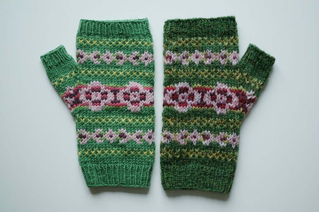
Back in 2020, my Bramble Mitts (Ravelry link) were published in Amirisu. The pattern sample was worked up in Quince & Co. Finch, and if memory serves, this was the magazine’s choice. My original preference for the design was Jamieson’s Shetland Spindrift, due both to the huge range of colors available and the put-up in 25 g balls (ideal for a small design featuring six colors if new yarn is required rather than using leftovers and stash yarn).
Quince & Co Finch is a lovely fingering weight yarn, but its smooth worsted construction and palette of solid colors lends a very different effect than the heathered shades of Shetland Spindrift. So when the magazine came out, I decided to cast on for a pair of Bramble mitts in Shetland Spindrift as well, sticking as closely to the original colors as I could.

Between one thing and another, these sat as an unfinished object for a long time. But I picked them up again earlier this year (ed. note: turns out it was actually about a year ago) and finished the knitting, and a few weeks ago I sat down and wove in all the ends as well. So now that they’re well and truly finished, I can show you both versions of the mitts!
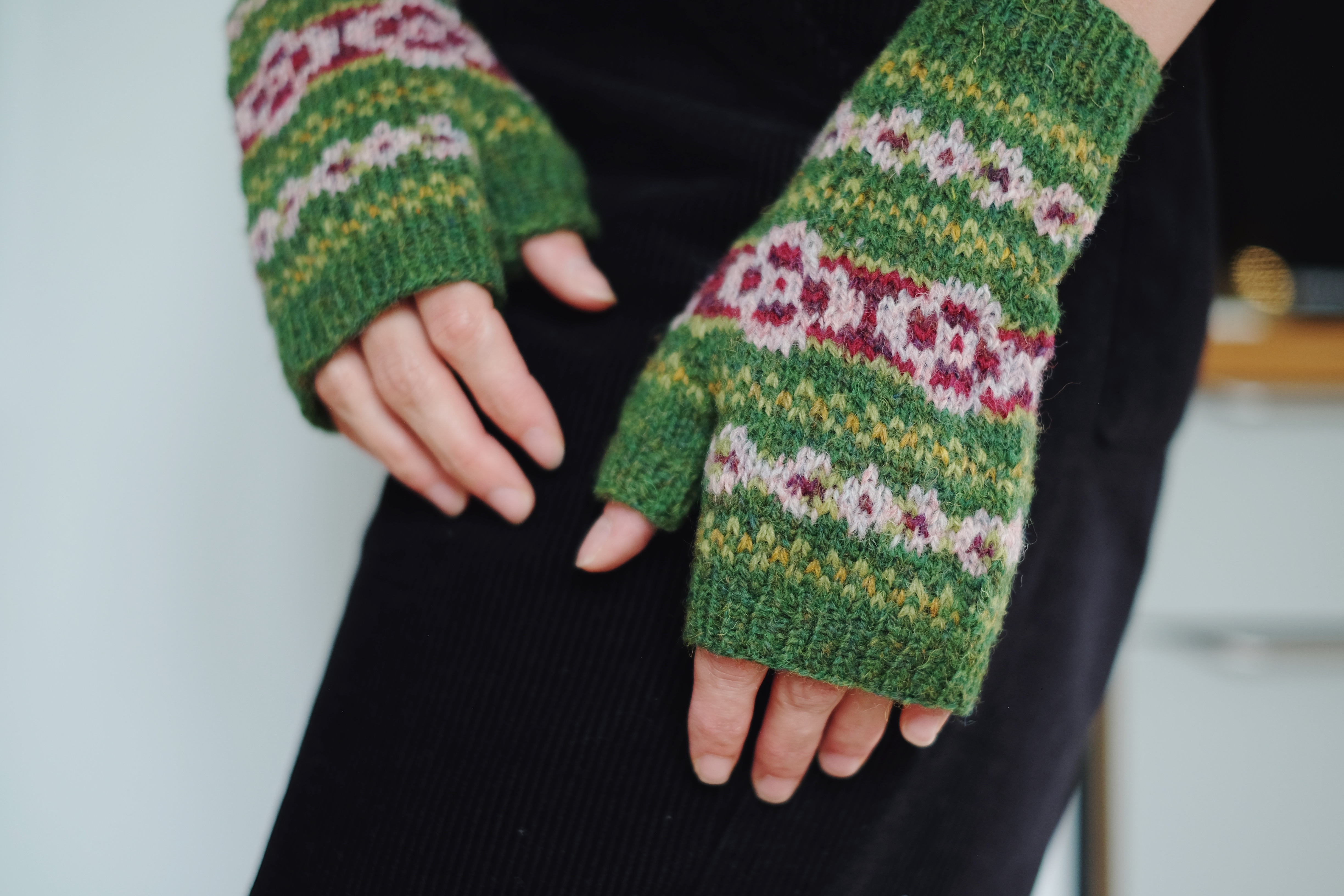
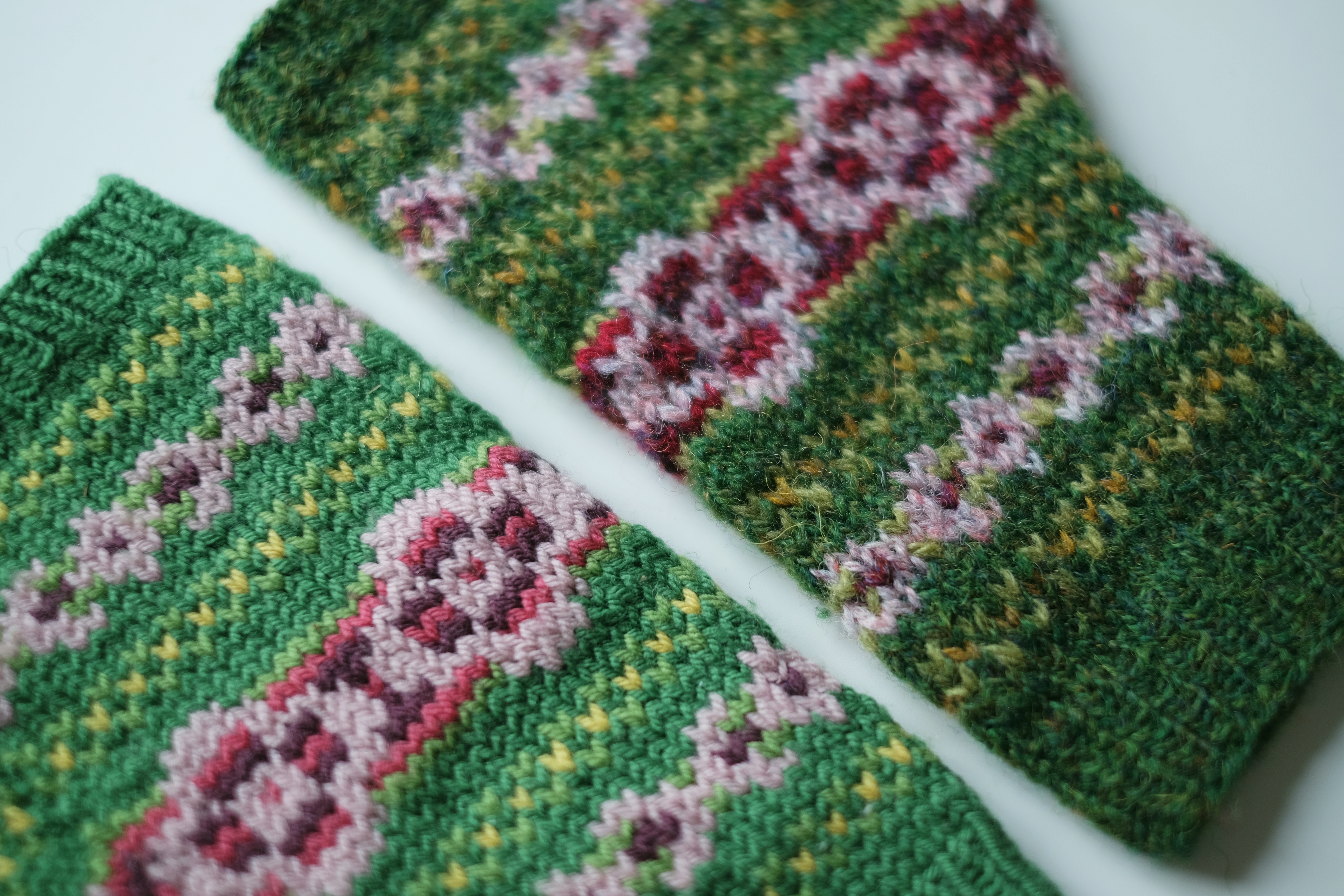
The heathered Shetland Spindrift version (above) definitely embodies my original vision for the design, but I admit when I laid both pairs side by side I was surprised at how subtle the difference felt. The colors are not an exact match but they’re close enough to demonstrate that the two yarns give a different feeling.

Smooth and worsted spun, Quince & Co. Finch is dyed in solid colors on a white base, and the colorwork is certainly very neat and tidy. Relatively even stitches, and the different motifs are very easy to pick out. Jamieson’s Shetland Spindrift, on the other hand, is a 2-ply woolen spun available in both solid and heathered shades, the latter sometimes containing all sorts of colors in one colorway. I made use of both in my project, but there are more heathered shades than solid ones. The stitches are less even given the different texture of the yarn, and the overall effect is fuzzier, even if the boundaries between the different motifs are clear. Of course several of the colors are slightly darker, which adds to the slightly moodier feeling, but in my view the fuzziness lends a softness to the mitts that the Quince version doesn’t have, rather that version is instead very bright and cheery.
When I’ve taught colorwork classes in the past I’ve talked about how I don’t believe in yarns that are “wrong” for colorwork, although some yarns may be better suited to some types of colorwork than others. But often it’s just a matter of what effect you’re going for. Quince & Co. Finch is not a superwash yarn but it shares many properties with a lot of the superwash yarns favored by indie dyers, and while the resulting fabric will have a different look and feel than one knit with a Shetland yarn, it is no less lovely. But the better you understand different types of yarn and the ways that they knit up, the easier it will be to achieve the final look and feel you’re hoping for.

Leave a comment