
This fall is shaping up to be my busiest ever for new releases, and I’d like to periodically share some of them here on the blog. Today I’m very excited to tell you about a book project I had theopportunity to be a part of, called Ruter og Lus: retrostrikk frå Salhus Tricotagefabrik. I want to let you know up front that it’s a Norwegian book, which means the patterns are pretty inaccessible to anyone who doesn’t live in Scandinavia or understand Norwegian (and it’s written in nynorsk – the less common written standard of Norwegian – which adds another barrier for non-native speakers). Nonetheless, it’s a very cool project, so I hope you enjoy hearing about it all the same.

Back in July I wrote a blog post about the Norwegian knitting industry museum in Salhus, outside of Bergen. If you haven’t read that post, I recommend checking it out, because it will provide some background for this book project. The museum is located at the old Salhus Trikotasjefabrikk, or knitting factory, and I mentioned in that post that “the museum maintains an archive of different patterned fabrics, with some of the patterns perhaps never actually being put into production.”
The museum decided a couple of years ago that it would be nice to revive that archive of patterned fabrics, and the way they decided to do that would be to take a selection of motifs/fabrics from the archive and hand them over to hand knitting designers, who would then create original designs for modern knitters using these fabrics from the archive. Since Salhus typically produced the kind of sweater known as an islender (or “Icelander” – I wrote a little bit about the origin of that term in my post about the museum), the motifs are all relatively small and repetitive, and would typically be used in an allover pattern on the sweater. This is represented in the name of the finished book: Ruter og lus.
If you’re familiar with Norwegian knitting, you may recognize lus as the first word in the compound lusekofte, and it refers to what we often call a “lice pattern” in English (lus meaning “louse”). Within the context of knitting, lus refers to small repetitive motifs, often a single stitch or pair of stitchs worked in a diagonal. Ruter is slightly more difficult to translate in this context – it essentially refers to squares and patterns with strong perpendicular lines, but it is not in itself the normal word for “square,” either. Plaids, ginghams, and other grids could all be described as “rutete” (an adjectival form). Nonetheless, the most typical islender is made up of repeating motifs of what are essentially squares and lice, and I assume that this is where the book’s title comes from.
But on to the patterns! I feel incredibly grateful to have been asked to take part in this project, and I’m quite proud of my two contributions: a sweater called Opal and a hat and mitt set called Dorthea. I found working on these designs an interesting creative challenge; I was one of the last designers to sign on for the project, and most of the motif options had already been claimed by then. So the two motifs I ended up with weren’t my first choice, but I’m very pleased with what I was able to do with them in the end (which is very satisfying).
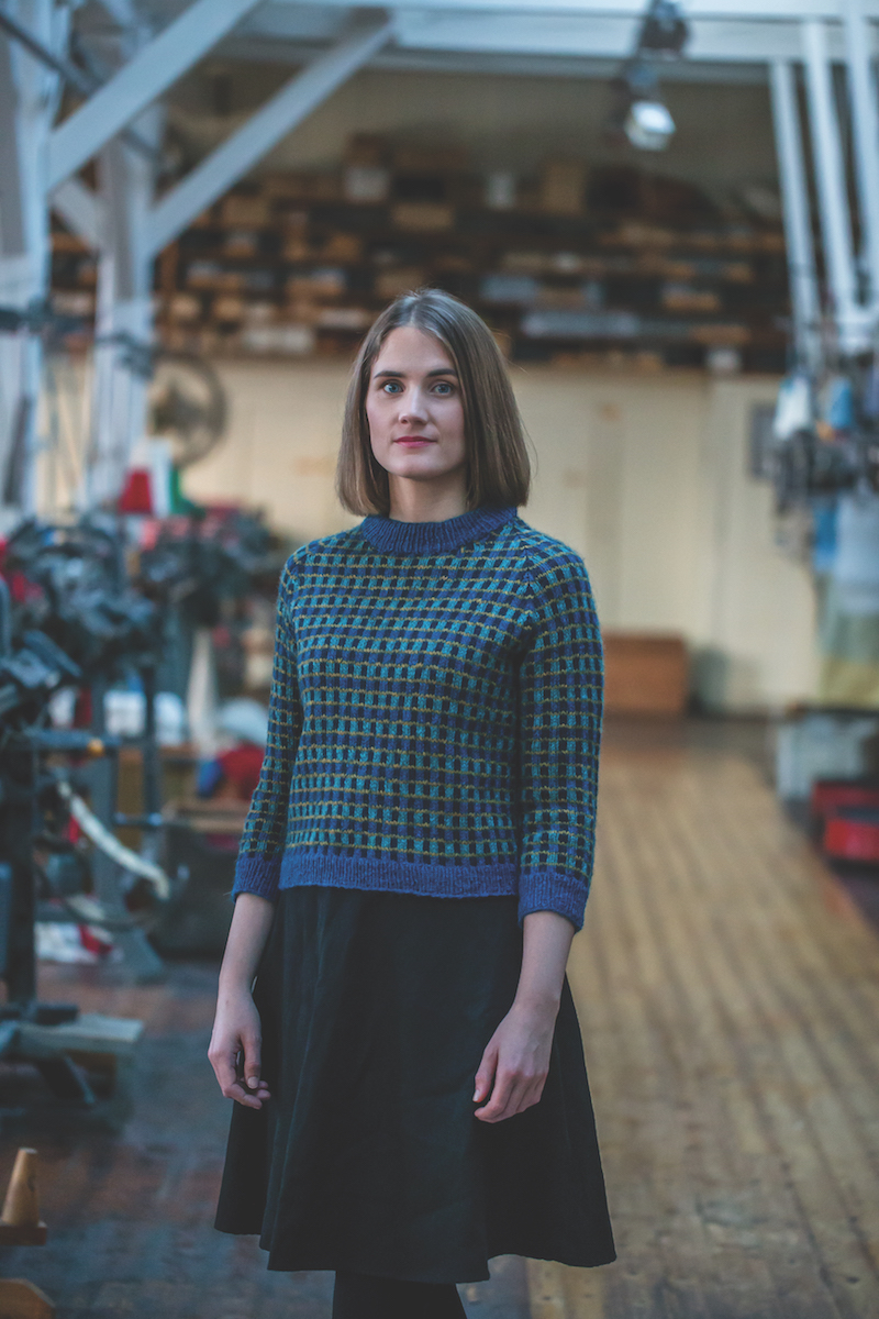
Opal was a challenge to work on at first because I found the original swatch photos pretty uninspiring, to say the least. Salhus thinks this particular motif in the archive is from the 80s, and as far as they know they don’t have any record of it being used for any of the knitwear they created. The motif uses four colors in total, and I decided to try charting up the motif with three colors from the same color family, and one from a different color family altogether. I love the blue version we ended up going with, which makes use of complementary colors, as three blue shades are accompanies by a golden yellow. I also swatched for a version with red/orange tones, making use of the same golden yellow contrast.

I love the finished sweater (huge thanks to sample knitter Torgun, who actually knit the sample) and I’m so glad the museum chose to go with the blue version, which feels very, very me. We chose to knit this one up in one of my favorite yarns, Tinde from Hillesvåg Ullvarefabrikk. Because of the bold, graphic nature of the motif, it’s possible to use a variety of shades that are relatively low contrast compared with other stranded colorwork, which makes the palette of Tinde (which is dyed on a natural grey base) really lovely for this.

The other pattern is a hat and mitt set called Dorthea, and once again I was not wholly enthused by the original swatches in the archive. I decided going fully monochrome might be a way to make this 5-color motif look a little bit less like sprinkles on a birthday cake, so I swatched up a greyscale version first. I didn’t even realize until I’d finished the swatch how much this motif suddenly recalled traditional Setesdal-style patterns. With a black base and five shades of grey, it was also a perfect opportunity to work a corrugated rib as a gradient – I feel like it makes a wonderful finishing touch. We also worked up the hat in an alternate colorway, using five shades of blue and blue-green.

We used Rauma Finull for this pattern, which feels like the perfect yarn for this with its massive palette of colors.
One of the things I love about this book is that the editors made it a priority to use Norwegian wool yarns for the patterns. While they didn’t exclusively include yarns made from Norwegian wool, they’ve still featured Norwegian wool pretty heavily, and it makes me so happy to see a Norwegian pattern book prioritizing that. The beginning of the book also features some information about the history of the mill/factory, so all in all the book feels like a really natural part of the recent revival of traditional Norwegian patterns and Norwegian wool in the Norwegian knitting community.
If you’re curious about what the rest of the book looks like, you can check out the other patterns on Ravelry here. The photos were shot at the museum, which I love, and while the collection of patterns as a whole does have a retro vibe (as the subtitle implies), I also think the designs feel very fresh and modern.

Leave a comment